Monday, October 24, 2011

Princess Fort!

Today's post comes from one of my dear Mom Friends. If you happen to live in a small space, are on a tight budget, or just don't want another toy that takes up the entire living room then this post is for you!

About the author:

Jeanne-Marie Grewe has two gorgeous daughters and after stumbling upon Pinterest and the world of craft blogs has become another proud member of Addicts of DIY projects. Enjoy!

Kaylee & Makenna's "Princess Fort"

You know those Fisher Price castle's? The one's that you can buy and put in your backyard or playroom for hours of entertainment? The one we really wanted was about $250. I don't know about you, but $250 for something that may or may not get used through the winter is NOT worth it to me. Plus, who has $250 sitting around these days?!

So, to Pinterest I go...to find something that would work for our 900 square foot home. I found this:


So we went to work! First, Kaylee and I went to WalMart for fabric. I had a gift card for $10 plus they were having a Labor Day sale. We picked out all of our fabric and were just about to go check out, when Kaylee spotted a purple princess sparkly fabric. This meant we had to go return the colors that Mommy had chosen and we were out to find the colors to "match" the princess fabric.

Luckily, Melissa came over and helped me with EVERYTHING else. :) Perhaps if I get a sewing machine someday, I can try and make another one...because I'm assuming this one will get wrecked. :)

This "castle" cost $15 in fabric, $6.99 in "no-sew adhesive" and about 4 hours. I would assume that if you did not have two babies and a 3 year old in the mix when you were making it, you could probably cut your time in at least half. But without the company...it's no fun.

So the steps to make this wonderful fort are simple. Measure your dining room table or any table in your house that you might use for this. You want to measure the following ways:

1. The top of the table (length and width) - this is fabric piece #1
2. All 4 sides of the table including the distance from floor to table top. This will give you all of your side pieces. 

Your 5 pieces should be cut by adding 1'' to your exact measurements for seam allowance. So if piece 1 is 56''x45'' you should cut your fabric at 57''x46''. Make sense?

Once all of your pieces are cut its as simple as sewing the 4 walls to the ceiling piece and then sewing the walls to each other. You are basically creating a box with no bottom. 


As you can see in our version I didn't measure the distance from the floor to the top of the table which meant there was A LOT of excess gathering at the bottom. It's not bad, but it doesn't look as polished.


For the windows on the house we cut 2-3 inch strips of fabric in whatever length you desire and then applied no-sew adhesive. Then iron on the strips into a window shape directly onto the fabric walls. Once they are firmly adhered cut out the interior portions of fabric so that you can see through the window. We found this way to be much easier then actually sewing the fabric strips to the walls. No-sew adhesive is AMAZING!!


Once you have it completed to this point place it over your table and then cut the entrance. We didn't finish the edges on the entrance, but you can apply more no-sew adhesive so it doesn't rip or fray. We simply just cut up high enough to ensure the girls had enough room to crawl in and out. Then the final touch was placing two slits about 12 inches to the left and right sides of the slit for the entrance. We then threaded a strip of fabric into each slit to act as "curtain pulls" for the door. This creates a very cute "princess" look and allows the girls to go in and out without pulling the whole fort off the table. 


The work is worth it for the smile alone :)


And this is the final project! The entrance isn't pulled back in this photo, but you get the idea in the picture above. Super easy, super inexpensive and super fun for all princesses!!!


My friend Jeanne-Marie Pinned it. Then Made it. And her daughter's Love it!

Monday, October 3, 2011

Cold Brew Coffee

Oh.Em.Gee.

Homesteading Housewife
So Pinterest strikes again. My wonderful friend Garyn - a beautiful, red-headed, coffee addict - happened to stumble upon this UH-mazing post from The Homesteading Housewife on her Craving Comfort food blog. It was titled, "The Last Iced Coffee Recipe You Will Ever Need!" and to be honest I couldn't agree more. Her picture alone makes me crave 90 degree-sunshine, along with a blanket in a park under a shaded tree, with said beverage in hand and a book in the other. Garyn also happened to make this recipe before I tried it and she loved it too! So, I knew it was worth giving it a whirl.

Thankfully, I took a lot of pictures for this particular post and I think it will help all of you (who decide to try this) understand exactly what cold-brewing coffee entails. It's not particularly hard, but it can be quite time-consuming and rather messy if your not careful, so just know you have been forewarned.

Thursday, September 15, 2011

Medallion Rug

Well finally I feel like I can share something with you that I haven't exactly seen elsewhere within the crafty blogger world. So in my last post I mentioned that I was going to be painting a rug and I didn't know whether or not I should go with a chevron print or a medallion print. Well after much deliberation and hours of pining away I made the decision to steer clear from the chevron print because apparently everyone and their mother now owns a rug that they painted themselves that has a chevron print on it... seriously I am not kidding. In fact I want you to open up a new window in whatever web browser you are currently using and type in "diy chevron rug", but do your search under images not the web. Okay do you see what I mean?! There are 62,000 image results for DIY chevron rus and most of them are actually chevron rugs not weird random images of farmers, cartoons or the occasional explicit photo. 


Now, I know that the chevron print is super trendy right now, so that is a large reason why its everywhere, but seriously I couldn't stand to be that much of a follower (although the print will be making an appearance in my kitchen for another project) so I sought out a new design element. I found a beautiful rug the other day that had this gorgeous medallion print on it and after seeking some design council from my dearest bestie and sidekick we both felt this was the perfect choice. 

Since I had to make my own stencil (buying one for $50 was not an option - yes custom stencils like the one I am about to show you are not cheap) I had to go with a design that was relatively geometric and thus easily to duplicate on my computer and then print and cut out by hand. What you will see below is an image I made using Microsoft word in their publishing layout. I just overlapped different shapes until I had something that mimicked the original rug I saw and then printed it and cut it out. Then I went to my garage and found some old cardboard and got to work.

From here I basically traced the stencil out onto the cardboard mimicking the design I wanted on a larger scale.


After I traced the stencil I cut it out with a razor blade or box cutter. Even though you can see that I traced portions of only half of the medallions I only cut out the whole ones. I just needed to see the entire image traced out for spacing purposes.

Now here is where I wasn't pleased. I knew that doing the stencil this way was going to place the emphasis on the medallion center instead of the trellis pattern you get from the surrounding space in-between the medallions. I originally wanted to paint the trellis pattern instead of the medallion center, but that would have required me to cut out 50+ of the medallions then tape them to the rug and then paint the exposed space around them. That would have taken decades. So I just sucked it up and went with plan b although I really wanted plan a.


So I measured my rug and then placed the stencil in the center because I wanted to make sure I wasn't going to be left with awkwardly stenciled edges that weren't mirror images of each other. At this time in the project my plan was to stencil the entire rug, but I ended up changing my mind. You will see why in the end.


I set my tape measure across the opposite end of the rug to act as a guide as I moved the stencil forward. I wanted to make sure I was moving in a straight line. I could have placed tape here as well, but I was lazy.


Then I surrounded my stencil with cardboard to prevent any excess spray from hitting the rug because again I like quick projects and spray painting the rug would be significantly more time efficient then hand painting it with a brush.


This is what it looked like after one row of the stencil being painted onto the rug.


Someone woke up from her nap and had to chill with me in the laundry basket as I finished spraying the rug.


Okay remember earlier how I said that I originally wanted to paint the entire rug with the stencil. Here is where I changed my mind. Since the pattern I was painting was the medallion instead of the trellis I thought it was going to be too much paint over the entire rug. If it was just the trellis instead then you would see most of the rug with only the outline being painted, but that wasn't the case here. Instead I was painting most of the rug and only leaving a little bit of the actual rug exposed. So I again consulted by sidekick and she as well agreed with me to just do a strip of the stencil pattern down the center of the rug and then see how it looked in our master bedroom (since that was going to be its new home). 


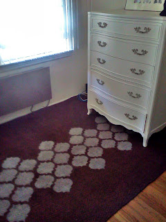
And boy was I glad that I did. I let the rug sit overnight on our back patio so that the paint had a full 12 hours to cure. I then brought it in and placed it in the little nook that is part of the weird floor plan that is our master bedroom. The rug fit perfectly and the medallion strip looked great with our new dressers. I was in LOVE.  

Here are some more pictures with different angles and lighting to show you how it looks. Eventually there will be a chair in the corner and a tiny bookshelf with a small side table to act as a reading nook. I also have a really cool (renter friendly) wall treatment that I am going to do to the wall opposite the dresser. That will hopefully be completed by this weekend. 


 I centered the dresser on the pattern to draw your eyes to it more. Pardon the messy wires and laundry basket. Our bedroom is a work in progress.


This is the pattern up-close. The rug is a brownish color and is made out of jute and I used a vintage white spray paint. (the color in the above photo is off since my picture app on my cell was on sepia opps)


Once again pardon the obvious mess. But this gives you an idea of where the little nook is within our bedroom... my dresser is to the left and our bed is to the right. More professional/completed photos to come once we are done. 


Even though it came out completely different then my original plan I was extremely pleased!


I Pinned it. I Made it.  And I Loved it!


A Few Things:
1. This project cost me $0.00 - I used a rug that we had lying around for the past 5 years and was 30 seconds away from being put on craigslist. I figured I should try and salvage what I could instead of spending $200 on a new rug. The paint I already had and the stencil I made from cardboard. You can definitely go buy a new rug and paint it, but its always nicer to do projects like this using the junk you already own. 
2. Be careful when spraying your rug. Overspray is always an issuing when dealing with spray paint, but honestly sometimes its worth it because of how easy it makes everything. My lines weren't super sharp, but it worked out well for my specific project. If you wanted super sharp lines I would hand paint your rug. It does give it a more finished look.
3. My rug was 100% just so I used basic spray paint. Nothing fancy and it has since dried completely and is not rubbing off and isn't scratchy under my feet. Sometimes just using what you got works out just as good as buying all of the specialty products... but not all the time ; )

Friday, September 9, 2011

Musings from a Mother

So I am sure most of you have seen all these super cool, trendy, artistic, inspirational sayings all over Pinterest. You know like these...


They are EVERYWHERE and the reason why is because they are super cute, quirky and make you reflect on certain things in life that are inspiring, positive or just plain funny. Well, I was out and about with Eliana and now that I have a daughter of my own I am much more shall we say aware of other children. I was watching a teenage daughter and her mother interact at Target and seriously I found it comical, I mean it was sad-frustrating-disheartening-and-worrisome, but none-the-less, comical too.


I know I have years until I have to worry about the "raging hormonal changes" of a teenager daughter, but even so my days of Eliana looking at me like a shiny new toy every morning are numbered. It's just a fact of life. I will embrace it when the day comes, but for now I just feel like jumping on the pinterest band-wagon and have decided to turn my Musings of Motherhood into a quirky quote to be oooh'd and awww'd by many or possibly just myself. Who knows. Either way its something I hope Eliana can reflect on during her teenage years... or possibly just another reason to think her mother is crazy. Enjoy :)


Thursday, September 8, 2011

Eat - Kitchen Sign

So a long time ago I was watching "Cougar Town", yeah I am not proud of this, but hey it was on after Modern Family and sometimes the husband and I would get suckered into watching it. I am not saying its a bad show, but its like watching Gilmore Girls on crack because the entire show is nothing but constant female banter. It was entertaining. Let's just leave it at that.

Anyhow, every time we watched the show I was always enamored by the EAT sign that Jules had up in her kitchen. Now I am generally not someone who puts up signs in her house that say "Family, Memories, Dreams" etc. Its just not my style. But for some reason stating the obvious in the Kitchen just felt right. It's almost comical. And I think that is why I like it so much. Also I had the perfect little wall space for it in our new casa so I just went for it.

I went to Michael's first to buy the letters, but they were fresh out of E's and since I wanted the letters to match (although doing different letters could be cool - tip for future word art) I had to go elsewhere. I ended up finding these specific letters at Walmart which was surprising. I originally went in for dog food and just happened to stumble across the craft section (it was on the 2nd floor in the far back corner in the complete opposite direction of the dog food - I can't help myself sometimes). I also liked the font A LOT better then the one's that Michael's had so I was even happier and of course they were cheaper (like $1+ per letter). 


So I was bad and totally didn't take a picture of them in their original state. This is how they looked after I spray painted them Nickel. I couldn't for the life of me figure out what color to paint them and decided to copy the main finish that was present in the kitchen. I thought they would look cool sort of blending in and not standing out, but as you can see in my first picture they blend in too much. We had friends over for Labor Day and everyone said I needed to paint them something different. Sooo I was out-voted on my original design choice.

Saturday, September 3, 2011

Wood Plank Artwork

Pinterest strikes again. I saw this amazingly creative piece of artwork using wood planks and was instantaneously in love. My husband saw it on my pinboard and also loved it and because I knew I would have his support in spending the $$ to make it I got to work. First and foremost let me give props and recognition to the original creator of this little piece of wonderfulness - The Simple Standard is a freaking awesome little shop on Etsy. If you like what you see and aren't crafty head on over to The Simple Standard and support this wife and mother from Hoover, Alabama. She has some really neat stuff.

Okay so here we go. This project is fairly simple and (my version) is rather cost effective. I know the original one is made out of a lot better materials (most significantly her choice of wood), but since I am all about budget I went el cheapo on my supplies.


Wednesday, August 31, 2011

Nursery Name Art

A couple of days ago one of my friends (who is going to have the world's gorgeous baby girl this November) asked me where I got/or if I made, Eliana's name art in her nursery. Well considering that it would probably have cost more $$$ then I was willing to spend, I most definitely made it. And the best part is it cost me zero dollars. I happened to have all of the items currently lying around my house/garage/bedroom/trash can etc. So if your a hoarder of craft supplies, frames, junk and other miscellaneous items then you too can make this for zero dollars. But have no fear, if you need to buy the supplies I am positive you can do it for under $10.

For my particular project I gathered the following items:
A large frame
Muslin Fabric - enough to cover the inside of the frame and use as a backing for the name art
Staple Gun - if you don't have one you can use hot glue for this part as well, its just more difficult
Hot Glue Gun
Tacky Glue - or any kind of basic craft glue (elmers will definitely work)
Lots of fabric scraps- size and color doesn't matter

Okay so here we go. The frame I used was previously wall art in the living room at our old condo, but since our color scheme changed in our new house I couldn't use it anymore. Luckily, it was the perfect frame for this project. And just for some background knowledge I picked this beauty up at a thrift store for like $5 and it was already painted the perfect shade of ugly green (my favorite color).

Before I jump too far ahead, let apologize for not having pictures for the "name" part of this project. My amazing friend Esther (she works for Anthropologie and thus has an amazing eye for design) made this sign for me below for my baby shower. I of course kept it because it was beautiful and I even though reusing a sign in E's nursery that said, "Welcome Baby Perea" wasn't necessarily gonna work I thought for sure I could find a way to re-purpose it. I love when I prove myself right.


Related Posts Plugin for WordPress, Blogger...